-

 Search for Promotional ProductsQuantity: NewCancel(800) 338-7996
Why Pastels Lead 2026: Why Soft Colors Are Winning in 2026 Design
04/09/2026
5 Minute Read
Soft Pastels Are Shaping the 2026 Color Trend Landscape
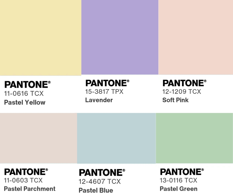
The 2026 color trend landscape is being shaped by a clear and intentional move toward softness, subtlety, and emotional comfort in design. Brands across industries are embracing pastel palettes because they communicate calm confidence and modern sophistication without feeling distant or overly minimal. In a world filled with constant stimulation, these soft hues feel grounding and emotionally approachable, creating a sense of ease that consumers instinctively respond to as they seek balance in everyday life. Shades like powder blue, muted lavender, pale sage, warm blush, and creamy neutrals evoke wellness and simplicity, creating a visual experience that feels welcoming, elevated, and thoughtfully designed. When applied to custom and promotional products, pastels offer a refined, lifestyle driven aesthetic that feels personal rather than overtly branded, allowing items to blend seamlessly into daily routines. This shift reflects a broader evolution in branding where color is used not just to capture attention, but to build emotional connection, trust, and longer lasting brand impressions.
Cloud Inspired Neutrals Set the Stage for Elevated Branding
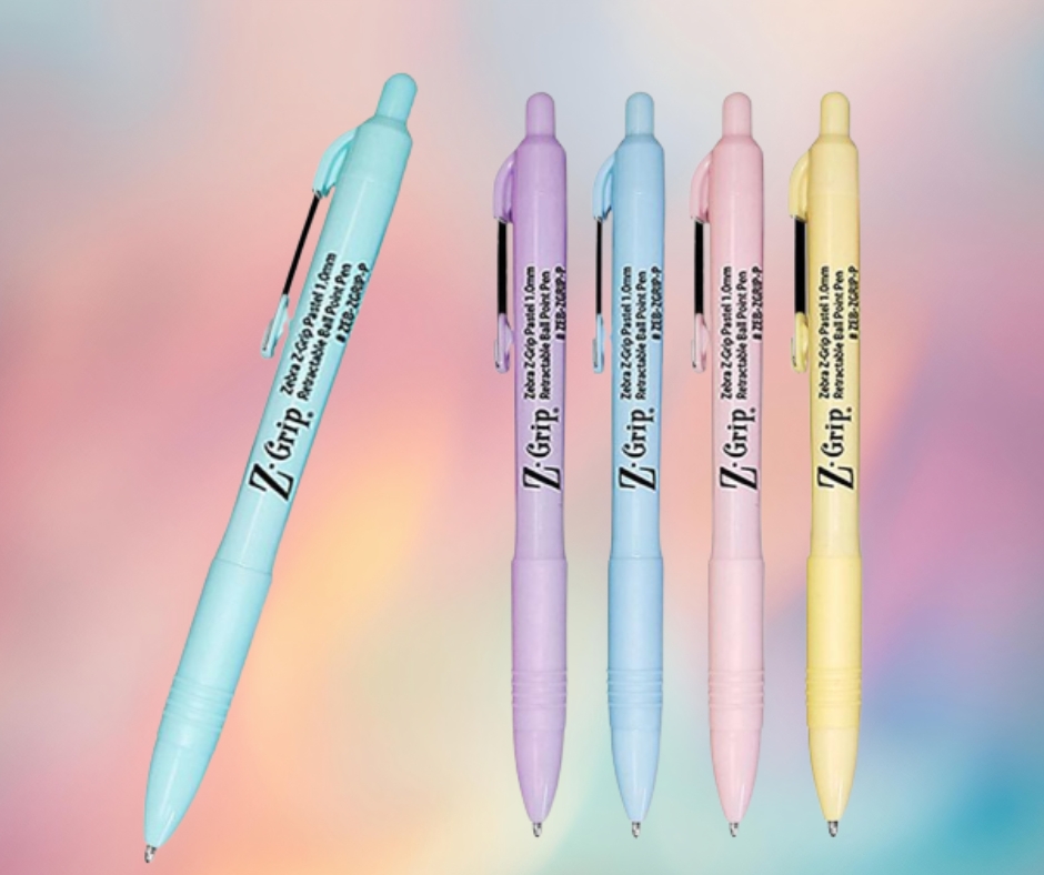
Cloud inspired neutrals and powdered pastels are shaping elevated branding for 2026 by working together to create a clean, airy, and intentionally designed aesthetic. Soft whites and gentle off whites provide a modern yet timeless foundation that allows custom branding elements to stand out without overpowering the product, communicating quality, intention, and sophistication in a subtle way. Layered with powdered pastels, this neutral base gains visual interest through calm, controlled color that feels thoughtfully balanced rather than bold or overwhelming. On promotional products like drinkware, mugs, water bottles, and travel accessories, this combination delivers a refined, contemporary look that aligns with lifestyle focused design trends. From a branding perspective, these tones keep logos and imprint designs crisp and legible while still feeling fresh and on trend, making them an ideal choice for brands that want versatility, longevity, and a premium presence.
How Color Choice Elevates the Perceived Value of Promotional Products
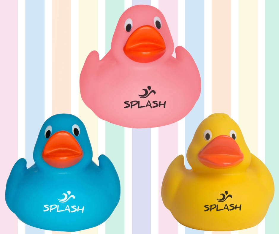
Color choice plays a powerful role in elevating the perceived value of promotional products, and pastel palettes are at the center of that shift for 2026. Soft, muted tones signal quality, care, and intention, making branded items feel thoughtfully designed rather than mass produced. As promotional marketing moves away from broad distribution and toward meaningful brand moments, pastel colored products are more likely to be kept, reused, and displayed, increasing long term brand exposure. These calm hues allow logos and messaging to integrate seamlessly into the product design, creating a sense of visual harmony and quiet confidence. Soft backgrounds give branding room to breathe, resulting in promotional items that feel polished, approachable, and lifestyle oriented instead of overly commercial. Brands that embrace this aesthetic communicate modernity, trust, and thoughtfulness through every branded touchpoint, transforming simple giveaways into lasting brand experiences. Pastel palettes also photograph beautifully, making these products more shareable across social media and digital touchpoints. This subtle visual appeal helps branded items blend effortlessly into everyday environments, from workspaces to homes to on the go moments. The result is promotional merchandise that feels less like advertising and more like a natural extension of the brand’s lifestyle and values.
The Long Term Impact of Choosing Pastel Color Trends
Pastel color trends stand out as a smart, future focused design choice because they combine visual softness with long lasting relevance, giving brands the rare ability to feel current without chasing short lived trends. While bold, highly saturated colors often make an immediate statement, they can quickly become dated as preferences shift, whereas pastels maintain a steady, timeless appeal that carries across seasons, campaigns, and years. This durability makes them especially valuable for promotional products that are meant to support long term branding strategies rather than one off moments. As brands move into 2026 with a stronger emphasis on sustainability, intentional purchasing, and brand consistency, the demand for colors that age well has never been higher. Pastel palettes naturally support this shift by offering flexibility across materials and product types, complementing a wide range of logos and design styles, and creating an elevated aesthetic that feels calm, confident, and thoughtfully designed. Over time, these softer tones help brands build visual consistency and trust, ensuring that promotional products remain relevant, desirable, and aligned with evolving consumer expectations long after they are distributed.
Why Soft Color Confidence Defines Branding in 2026
The defining color story of 2026 is rooted in calm confidence, emotional balance, and intentional design choices that feel both modern and deeply considered. Soft pastels and cloud inspired neutrals reflect a broader cultural shift toward wellness, simplicity, and meaningful connection, signaling a move away from loud aesthetics toward more thoughtful visual communication. When applied to custom and promotional products, these color palettes transform everyday items into refined extensions of brand identity rather than disposable marketing tools. They give brands the ability to express personality without visual noise and project sophistication without excess or overstatement. More importantly, these softer tones create a sense of trust and approachability that resonates with audiences on an emotional level. As consumers continue to value brands that feel authentic and grounded, color choices play an increasingly influential role in perception and recall. In 2026, soft color confidence is not simply a trend, but a strategic branding decision built on longevity, emotional resonance, and the power of subtlety done well.
Shopping Cart
Interested in buying promotional products and have questions for us? Then the Quote Cart is perfect for you! Click the "Request Quote" button on any product page to start requesting your quote. Make sure to let us know any additional details in the questions section.

You have not yet added any products to your cart yet. Time to start shopping! :)
If you have more than one ordering account, you may have created a shopping cart in a different account. You can toggle between your ordering accounts below:
Active Ordering Account:
Contact Us
(800) 338-7996
Helpful Links
Phone Numbers
(800) 338-7996 Toll Free
(615) 991-4000 Local Phone
Fax Numbers
(866) 323-8381 Fax
(615) 246-4198 Local Fax
Email Address
orders@execad.com
Contact Us Form
Contact Us Form
Physical / Mailing Address:
Executive Advertising
181 E. Main St.
Ste 4
Hendersonville, TN 37075
Contact Us Form
Help Section Search
Quick Help Links
Will I receive an Artwork Proof?
Existing Customers (Before 12/17/2020)
Leave Feedback
Glossary
Production Time
A standard production time for each product is listed on each product page.
Production times may vary depending on decoration methods, number of locations, and product type.
Production time do not include shipping transit times or artwork proofing times.
On each product page you can enter your shipping zip code and see how long it takes for your order to be produced and ship to your location.
Rush production options may also be available.
Report a Problem
Provide your Feedback
We've recently launched a new website, and we'd love to get your feedback! Let us know your thoughts on how we can improve your customer experience.
Give our new website a rating:
{{addedComment}}
Comment Sent. Thank you!
Click here to view our company's terms of sales.
{{ messages.email.success }}
{{ messages.phone.success }}

Share your thoughts on our website:
Minimum 5 characters required.