-

 Search for Promotional ProductsQuantity: NewCancel(800) 338-7996
Pantone Meets Branding: How Color Shapes Brand Identity
01/08/2026
4 Minute Read
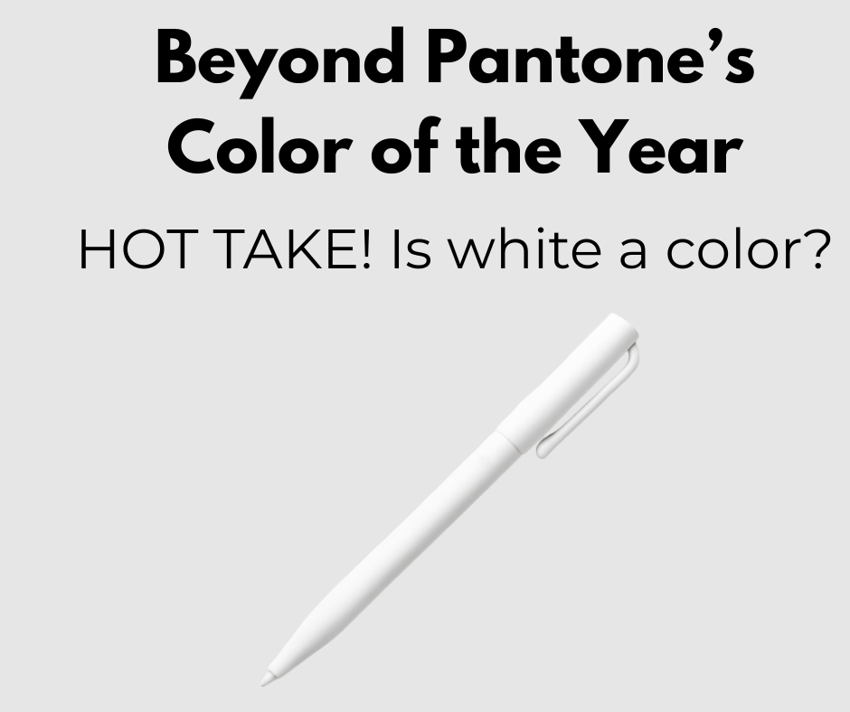
HOT TAKE! Is white a color?
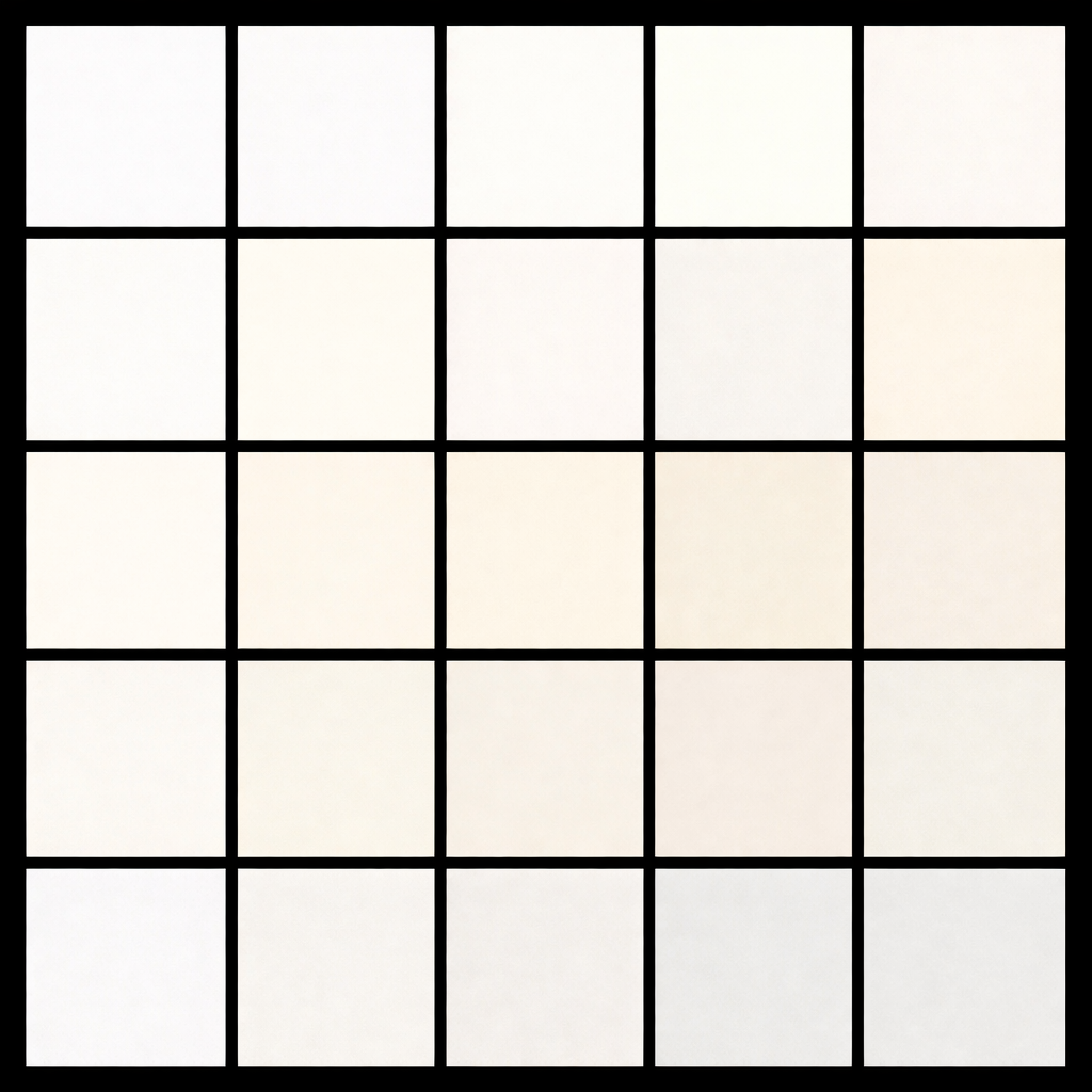
It is a question that sparks debate every year in design circles, branding meetings, and creative brainstorms, especially when it comes to choosing promotional products that are meant to represent a brand long term. While white is sometimes dismissed as the absence of color, in branding and branded merchandise it functions as a powerful choice all its own. White carries intention and influences how people think, feel, and behave, which makes it especially impactful in promotional products that live within everyday routines. It communicates clarity, confidence, restraint, cleanliness, modernity, and trust. Hospitals use it to signal care and sterility, tech brands rely on it to project simplicity and innovation, and luxury brands use it to convey exclusivity and refinement. These associations are not accidental. They are built through years of visual language and consumer psychology. In a world saturated with bold palettes and fast trends, white stands out by doing less and meaning more. On promotional products, it creates space for logos and messaging to stand out, lets the brand take center stage, and proves that when a color consistently shapes perception, it earns its place as a true and powerful color choice.
Where Trend Influence Meets Timeless Merchandise
White promotional products have a quiet confidence that other colors often cannot match, creating an elevated and intentional feel across categories like tumblers, totes, notebooks, and tech accessories. These items blend seamlessly into daily routines, which extends product life and increases brand exposure over time. They look clean on a desk, polished in a gym bag, and premium in a meeting or conference setting. As branded merchandise, this color functions as a refined canvas that highlights form, texture, and quality while allowing a logo or message to stand out without visual competition. At the same time, the Pantone Color of the Year shapes how people think about color across industries, influencing fashion, interiors, packaging, and branding. When decision makers see a color consistently celebrated, it builds confidence and serves as validation that their choices feel current, thoughtful, and aligned with cultural direction. Even when brands do not use the exact shade, the broader conversation around the Color of the Year encourages more intentional, strategic color decisions in promotional products.
Why Color Choice Shapes Brand Perception
Color is often the first thing people notice and the last thing they forget, shaping perception long before a logo is read or a message is understood. The wrong color can cheapen an otherwise strong product, while the right one can instantly elevate it and influence how a brand is perceived. White fits into everything because it is the ultimate foundational color, a true basic that checks every box across industries, audiences, and use cases. It adapts effortlessly to any brand personality, works with every logo color, and feels appropriate in both casual and corporate settings. White communicates intentionality and confidence, signaling restraint, quality, and clarity of vision without overpowering the product or the brand. In promotional products, where versatility, longevity, and broad appeal matter, white allows branded items to move seamlessly through daily life while acting as a polished, reliable canvas that reinforces brand values at every touchpoint.
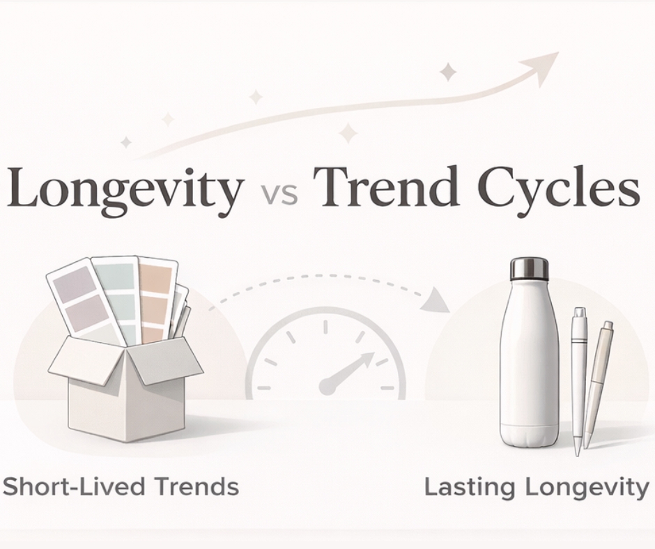
Longevity vs Trend Cycles
Fast moving color trends may dominate headlines and social feeds, but promotional products live in the real world, not the trend cycle. These are not fleeting moments or disposable content. They are long term brand assets that sit on desks, travel in cars, move through gym bags, and become part of daily routines for months or even years. That permanence changes everything about how color should be chosen. It turns color selection into a strategic branding decision rather than a reaction to whatever shade is having a moment. White delivers on that strategy by offering longevity that trend driven colors simply cannot. It stays relevant long after the Color of the Year conversation fades, never feeling outdated or out of place as palettes evolve. Instead, it maintains a clean, modern presence that consistently reflects well on the brand, allowing promotional products to keep working, building trust, and reinforcing brand impact long after the trend cycle has moved on.
A Timeless Approach to the Color of the Year
The Pantone Color of the Year may set the tone for creative conversations, but lasting brand impact comes from intentional choices that outlive any single trend. White proves that a color does not need to be bold to be powerful. It communicates trust, clarity, and confidence, elevates promotional products across every category, and adapts seamlessly to any brand strategy. As a foundational color, it allows logos, messaging, and customization to shine while supporting longevity and consistent brand presence. For companies investing in branded, custom, and personalized merchandise, white is not a default. It is a deliberate, executive level decision that balances cultural relevance with timeless appeal and ensures promotional products continue working long after the Color of the Year conversation fades.
Shopping Cart
Interested in buying promotional products and have questions for us? Then the Quote Cart is perfect for you! Click the "Request Quote" button on any product page to start requesting your quote. Make sure to let us know any additional details in the questions section.

You have not yet added any products to your cart yet. Time to start shopping! :)
If you have more than one ordering account, you may have created a shopping cart in a different account. You can toggle between your ordering accounts below:
Active Ordering Account:
Contact Us
(800) 338-7996
Helpful Links
Phone Numbers
(800) 338-7996 Toll Free
(615) 991-4000 Local Phone
Fax Numbers
(866) 323-8381 Fax
(615) 246-4198 Local Fax
Email Address
orders@execad.com
Contact Us Form
Contact Us Form
Physical / Mailing Address:
Executive Advertising
181 E. Main St.
Ste 4
Hendersonville, TN 37075
Contact Us Form
Help Section Search
Quick Help Links
Will I receive an Artwork Proof?
Existing Customers (Before 12/17/2020)
Leave Feedback
Glossary
Production Time
A standard production time for each product is listed on each product page.
Production times may vary depending on decoration methods, number of locations, and product type.
Production time do not include shipping transit times or artwork proofing times.
On each product page you can enter your shipping zip code and see how long it takes for your order to be produced and ship to your location.
Rush production options may also be available.
Report a Problem
Provide your Feedback
We've recently launched a new website, and we'd love to get your feedback! Let us know your thoughts on how we can improve your customer experience.
Give our new website a rating:
{{addedComment}}
Comment Sent. Thank you!
Click here to view our company's terms of sales.
{{ messages.email.success }}
{{ messages.phone.success }}

Share your thoughts on our website:
Minimum 5 characters required.